
The American Psycho business card scene is iconic, and despite the glaring printing errors, the cards seem to inspire a lot of designers and business professionals alike.
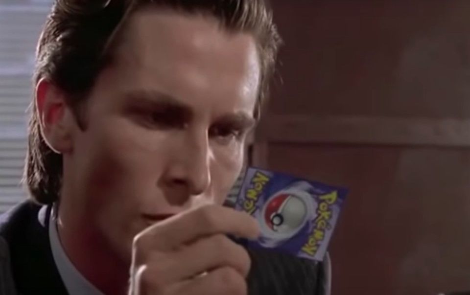
We're quite confident they didn't have Pokémon cards on set, mainly as they likely didn't exist when the movie was made...
We previously spoke about clever business cards in our listicle here: https://www.glasgowpdc.co.uk/10-clever-business-cards.
After another phone call quoting inspiration from American Psycho, we had a look to the iconic scene to delve back in to the world of Business Cards for the astute professional.
If you haven't seen this iconic cult classic, we've inserted the 3 minute clip below. It's not really a spoiler, don't worry.
Powerful. Eerie. Ominous.
Whilst character traits are being hinted at, and grown in the clip above, what we're actually going to focus on is the actual cards.
Colour, weight, material, font, and many more options...
When designing, and printing, your business card there are many variables. We're always happy to show samples of great cards and suggest solutions that'll best fit your business/brand. So what should you be thinking about?
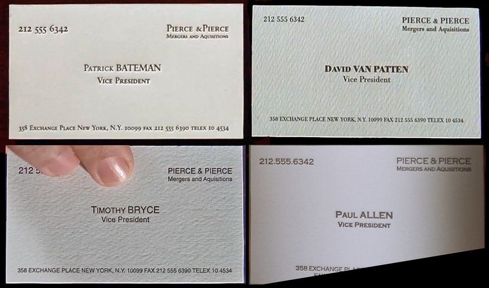
In the four cards shown, they're all on white backgrounds yet attention is drawn to the vast shade options available.
Whether you fancy 'bone' or believe 'egg-shell' is more elegant, there really are a vast sea of choices available.
What we love about this? The minimalism, the simplicity. Dark text on a plain light background. It's timeless, it's crisp, it's professional and it's efficient.
Spot the mistakes
It's probably a good exercise to have a good look at the four cards show above and see if you can find any mistakes.
There are quite a few changes we'd recommend for Patrick's card for sure. The value of having a printer proof your design (or create your design for you) is that printers see thousands of designs and know what to look for. You'd be amazed at the amount of event flyers that forget the date, or the event, or some other crucial information.
In Patrick's card ' Pierce &Pierce ' could do with an additional space after the ampersand. It could do with spelling acquisitions correctly. We'd also recommend lining up the information properly as there's a displeasing white space at the top of the card compared to the bottom. The gap between 'Patrick Bateman' and 'Vice President' should be less, to match the space size under 'Pierce &Piece' and we'd also centre his name with his title as they don't lineup very well.
It's almost surprising how many mistakes you can find from such a simple design, but this makes it an excellent example of why attention to detail is key. As we've said before, your card is a representation of your business. If you give out a poor quality of design, or a poor quality of material, then you're unwittingly suggesting that your business is a little sloppy, or careless or cheap. Be sure to give your business cards the quality they deserve - the quality you deserve.

Define your goals
It's always important to have a planning stage before you start your design. You'll want to think about your goals and which routes you can take to achieve them.
An interesting collection of thoughts can be found in the best-selling book by Paul Arden, 'It's not how good you are, it's how good you want to be.'
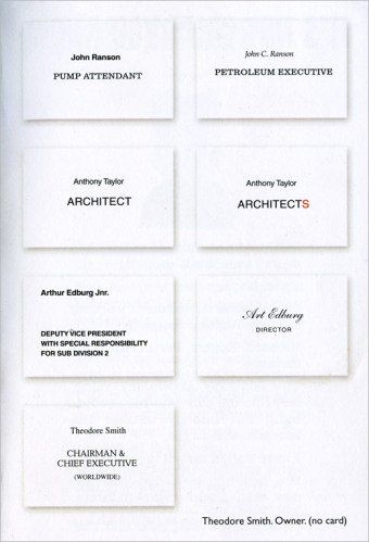
Here we have four examples of effective tweaks for business cards. The cards on the left column we will assume as the 'un-planned', that is to say: how a card may end up when the planning process isn't given proper time and effort.
Turning 'Pump Attendant' to 'Petroleum Executive' instantly gives a sense of grandeur to John Ranson. The lightening of the text, combined with the italics, gives a more stylish flare to the presentation of the card. It's a nice example of how an individual may want to stand out as a more credible choice amongst peers.
Next is such a subtle but genius change. By adding a letter 's' to 'Architect', it becomes implied that Anthony is part of a collective and this conjures up an increased sense of expertise and professionalism. Whilst Anthony will be doing the exact same work, if a client believes he's representing a group then they'll likely assume his reputation can be enhanced. Perhaps it'll be a bit of a white lie, but it's food for thought for all the sole traders!
Keeping it simple is often advised. It's really about knowing your target market here as we would also consider the overwhelming long title to have it's own use at targeting a niche. In general, shortening to 'Director' gives a feeling of much more importance and the card becomes more impressive.
Finally is an interesting example for a printers to mention. It's suggested that a Chairman & Chief Executive can simply be far too important to follow the norm of business cards. We never want to talk ourselves out of business, but if a client doesn't need a product that they're asking for, we think it's only fair we ask the right questions and ensure we're doing all we can to provide a top job for them.
You'll be amazed at the amount of options we can offer you for business cards.
Foils, metallics, duplexing, triplexing, multiplexing, transparent cards, recyclable material, waterproof material, rounded edges, custom shaped, etc etc etc...
Get in touch with us today, whatever the stage of your Business Card journey - let us create something truly fantastic to represent you.