
Brand evolution is common as digital trends and consumer habits constantly evolve. However, people like familiarity and often reject changes from solid institutions they've come to know. When Glasgow Warriors unveiled their new logo, the replies were varied...
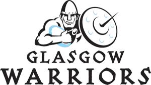
For reference, here is what the logo was. A man with a spiked shield and helmet, holding a rugby ball. Seems apt enough, and the font nods to a typical 'ye olde' celtic font atypical of Scottish designs.
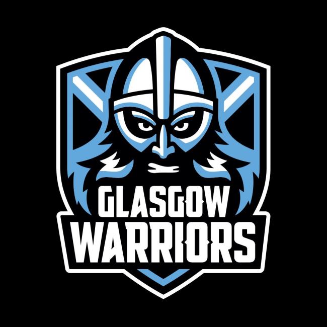
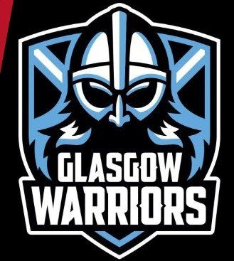
And here it is. The bringer of controversy.
The new logo has more of a cartoon-esque feel to it, not to dissimilar to that of American football or ice hockey crests. The helmeted man is still prominent, now with the shield behind him and the suggestion of a Saltire cross (or two swords) behind the man. The font is much more 'impact' styled, making it feel quite modern.
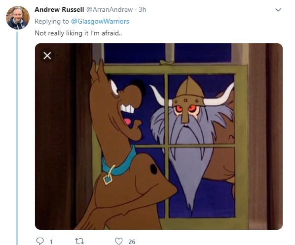
What everyone has been saying
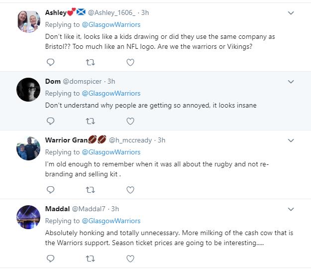
Mixed feelings... ish... but the majority of comments are either in outrage or simply ridiculing it.
What we think about it
There's probably one tweak we'd instantly make to the new design - and that's removing the eyes and mouth to very slightly simplify it and very slightly 'mature' the design. Someone pointed out that the New York Yankees logo is so popular for its simplicity, and that anyone would happily wear it whereas this childish Viking styled warrior may not be 'adult' enough for many.
It's a subtle change but...
We totally understand the criticisms, it's not to everyone's taste and it's unsettling when your beloved team changes a huge core part of their identity. However, we think there are lots of merits to this that will have some powerful factors in the future.
1. It's compact and neat.
The 'shield' element of the design is now the crest, it is tried and tested and proven to be a very efficient way to display a sports logo. It'll look neat on shirts, social media, watermarks, letterheads, everything. The previous logo wasn't bounded together as effectively, so could look clunky as a patch, or need shadows and background panels added depending where it was being placed.
2. Evolution is a part of most big business ventures.
It's not uncommon for logo/branding changes to meet an uproar, but it's part of a journey most businesses venture on to stay up-to-date and relevant. Staying still forever can't work for everyone.
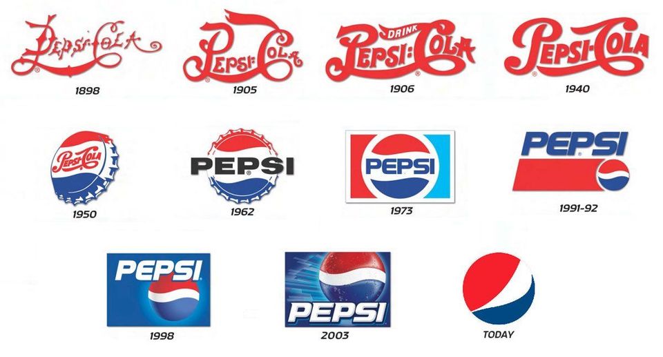
Just look at the journey Pepsi has been on! Granted it's been over 100 years long, but you can see the various stakes they've gone through until now being so huge they simply need their logo to be recognised. Most people probably don't realise the circular logo is based on a bottle cap!
Why re-brand- what could be the benefits?
When is the last time you checked your own branding?
Does it represent your company/business well? Does it suggest any of your values, any of your features?
It's very common for the branding to originally be set up purely aesthetically. The design may look 'cool' or 'sleek' but it might not really have much purpose. Perhaps the branding stopped at the logo, there are big benefits to picking consistent colour schemes, fonts and styles that will become part of the brands voice.
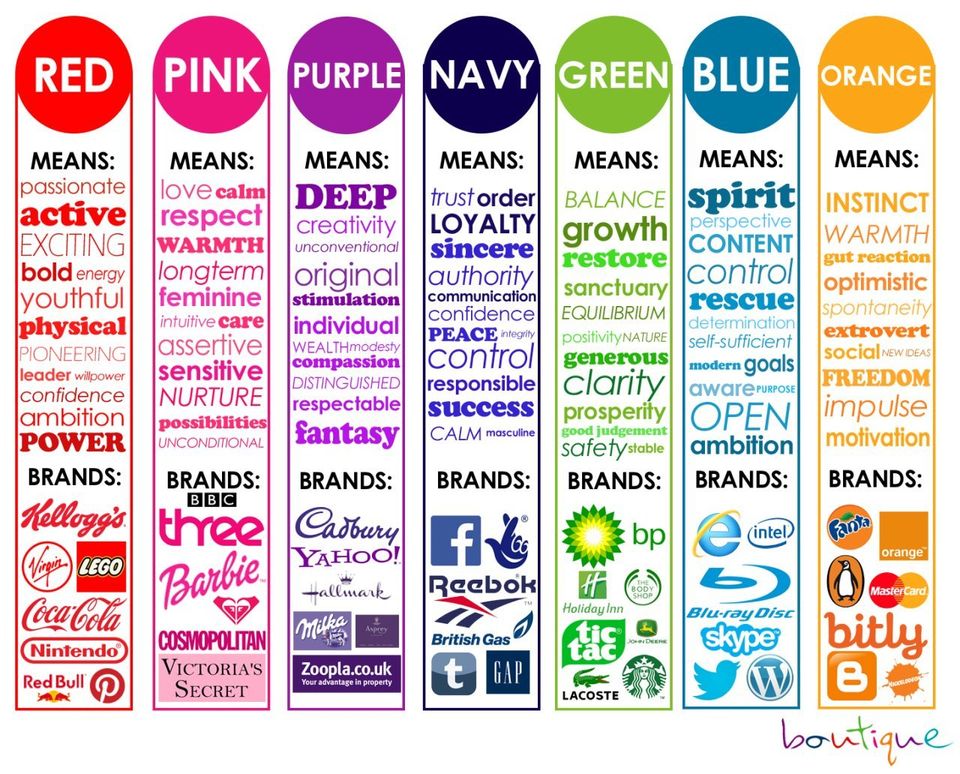
The above info-graphic from 'Boutique' (please contact us if you have their link to credit!) is fantastic for illustrating thought being branding. Focusing purely on colour, it shows how different colours evoke different feelings. If being eco-friendly is important to you, then green is a great colour to highlight that.
Again referring to the Pepsi examples, sometimes styles just become outdated. It may be stylish to revert to a 'retro' style when everyone else is going modern/contemporary, but you don't want to just look left behind! Make sure your website is up to date, your communications are active (such as social media channels) and that your branding is relevant in today's marketplace.
What you should consider to accompany your re-brand
If you choose to re-brand, and get it done well, you'll have many things to think about.
As a printing company we are often given various jobs to accompany a re-brand such as:
- Letterheads
- Business Cards
- Newsletters
- Flyers
- Posters
- Signage
- Stickers
- etc, etc, etc
Basically, the last thing you want is to be handing out the wrong branding as it shows lack of attention to detail nor care.
To go back to the original Glasgow Warriors example, we'd also be suggesting this is an opportunity for them to further solidify this change as a positive, strong one by reflecting that in their new print materials.
Going from the ordinary white backdrop style - they can make a striking impression with the bold black background, perhaps using the UV Spot technique to make their design shine. Printing on a thick, premium paper stock would also reflect strength and solidity in the brand.
As it's a new logo they will want as many people to recognise it, and get used to it, as possible. This is where upping marketing efforts would be useful, whether it's through canvasing flyers, sticker drops, logos printed on balloons at events or any other visibility drives - it'd all help the brand journey.
Thinking about rebranding? Get in touch with us for help on your print requirements, and for help and advice on the journey!